Your cart is currently empty!
Author: Fernando Angulo

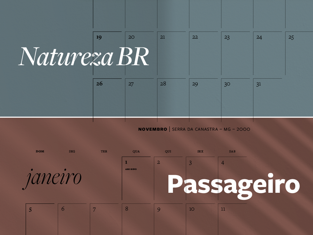
Passageiro & Natureza BR – 2025 Photo Calendars
Introducing our exclusive 2025 photo calendars, Natureza BR and Passageiro, meticulously crafted to bring art and organization into your daily life. Each calendar features stunning analog photographs by Fernando Angulo, capturing the essence of Brazil’s landscapes and the poetic passage of time. Natureza BR immerses you in the serene beauty of Brazil’s natural landscapes. Each…
A drifting and lyrical visual story of our shared humanity
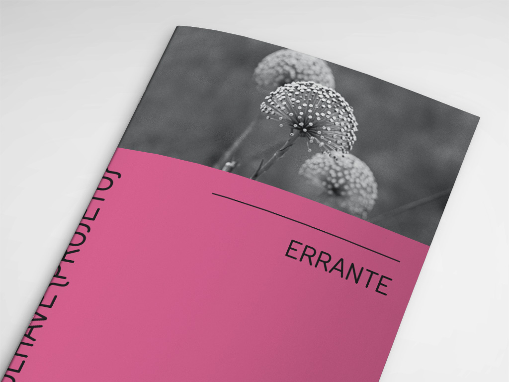
Errante is a journey that records the outside world to reveal something inside. An analogue development of black and white photographs. Enjoying a photograph in print is like smelling a new book or listening to a vinyl record. It’s about reliving the moment and travelling back in time.A time that took place in another era.…
Visual identity transformation for Industry 4.0
Treetech Tecnologia, a leading company in the monitoring and control of critical assets, has always been at the forefront of innovation, aligning itself perfectly with the concepts of Industry 4.0. Its constant quest for excellence and efficiency has made it a leading name in the sector. Aware of the importance of a visual identity that…
Crafting modernity with sustainable vision
Moder – Smart Building, an innovative engineering company that stands out for its pioneering use of steel structures (Light Steel Frame), chose Angulo Design for a comprehensive branding and visual identity project. With a clear focus on innovation, rationality, structure, technology and logistics, the challenge was to create an image that accurately represented these concepts…
Three generations, one identity: the evolutionary ‘M’ of Matheus
The brand identity for Matheus Advogados Associados is a tribute to legacy and tradition. Featuring three stacked “M” letters, the design symbolizes the three generations of the Matheus family, all dedicated to the practice of law in Brazil. This visual mark reflects their enduring commitment to excellence and family heritage. …
A circle of trust: design symbolizing enduring quality
The main idea is the infinity symbol, indicating Montcalm’s permanent commitment to guaranteeing the quality of its services, as well as the idea of the company’s continuity for many, many years to come. The circles duplicated in sequence convey a sense of movement and are a direct reference to the geometric circular designs in the…
A B&W look at brazilian nature
Transform your space with the natural beauty of Brazil. The Brazil Nature collection is a celebration of the grandeur of Brazil’s natural landscapes, captured in black and white in an elegant and timeless way. Each image is a story, told through shadows and contrasts, inviting the viewer to explore the details and delve into a…
The more it says, the less you know
The square of the display sets the tone for the compositions, which are elegant and categorical. It creates a geometry full of sensations, surfaces, smells and colors. Magenta, blue, red and ochre. Earth, air, sea and sky are elements and characters in the printed images that mimic a window onto a real, or rather dreamlike,…
Codes of visuality: the same constellation of intentions
Visual poetry has always been more than a bridge between word and image. Its lineage is undoubtedly concretist, because it has its eye on the universe of the driest signs, and it is as lean as Concreta, when it glues together forms and meanings. Even within the lineage, the biggest difference is the mixture. From…
Logofolio 2020
A look back at the evolution of Angulo Design’s branding journey. Each logo tells a story of creativity, craftsmanship, and innovation. This retrospective showcases the diverse visual identities we’ve crafted, each one uniquely tailored to reflect the essence of our clients’ brands.
The poet of mathematics
Poet, artist and designer Gastão Debreix hybridizes all forms of creation in this editorial experience, based on his exhibitions and verbal-visual installations. The edition is very well designed, with a cover in textured ink and a back cover perforated with a special knife to create a visual poem that the “reader” manipulates. It uses all…
The journey of visual poetry: 35 years, countless forms
ARTÉRIA reaches its 10th issue, also in offset, contrary to expectations: 1) that it might not come out at all; 2) that, as was the tradition, it would undergo a substantial change in form (there was only a slight reduction in format). Everything indicates that, of the magazines circulating in the country, it is the…